


November 09, 2004
Population Density Map
This particular one is also uses shades of purple to show which counties were just slightly Republican or Democrat.
Comments are disabled.
Post is locked.
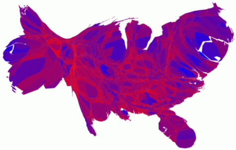
A much better picture for the Democrats than we were originally seeing in the county map.
Found at Pearly Gates.
Posted by: Ensie at
05:47 PM
| Comments (5)
| Add Comment
Post contains 45 words, total size 1 kb.
1
Things look much brighter for the Democrats in Jackson Pollock's America.
Posted by: Mediocre Fred at November 10, 2004 02:50 PM (mYTgd)
2
Well said, Fred.
Posted by: ensie at November 10, 2004 05:43 PM (4k5pf)
3
Still an awful lot of red. And most of those purple counties are safely in the Republican column as well. (I think they used purple for anything
Posted by: Richard at November 10, 2004 07:59 PM (ySs5Q)
4
Damn thing cut me off...
...anything under 10%, so many aren't very close at all.)
Just wanted to kick you while you're down. 
Posted by: Richard at November 10, 2004 08:01 PM (ySs5Q)
5
Thanks for thinking of me, Richard. 
Posted by: ensie at November 11, 2004 05:31 PM (4k5pf)
16kb generated in CPU 0.0281, elapsed 0.0858 seconds.
88 queries taking 0.07 seconds, 221 records returned.
Powered by Minx 1.1.6c-pink.
88 queries taking 0.07 seconds, 221 records returned.
Powered by Minx 1.1.6c-pink.

